Featured Work
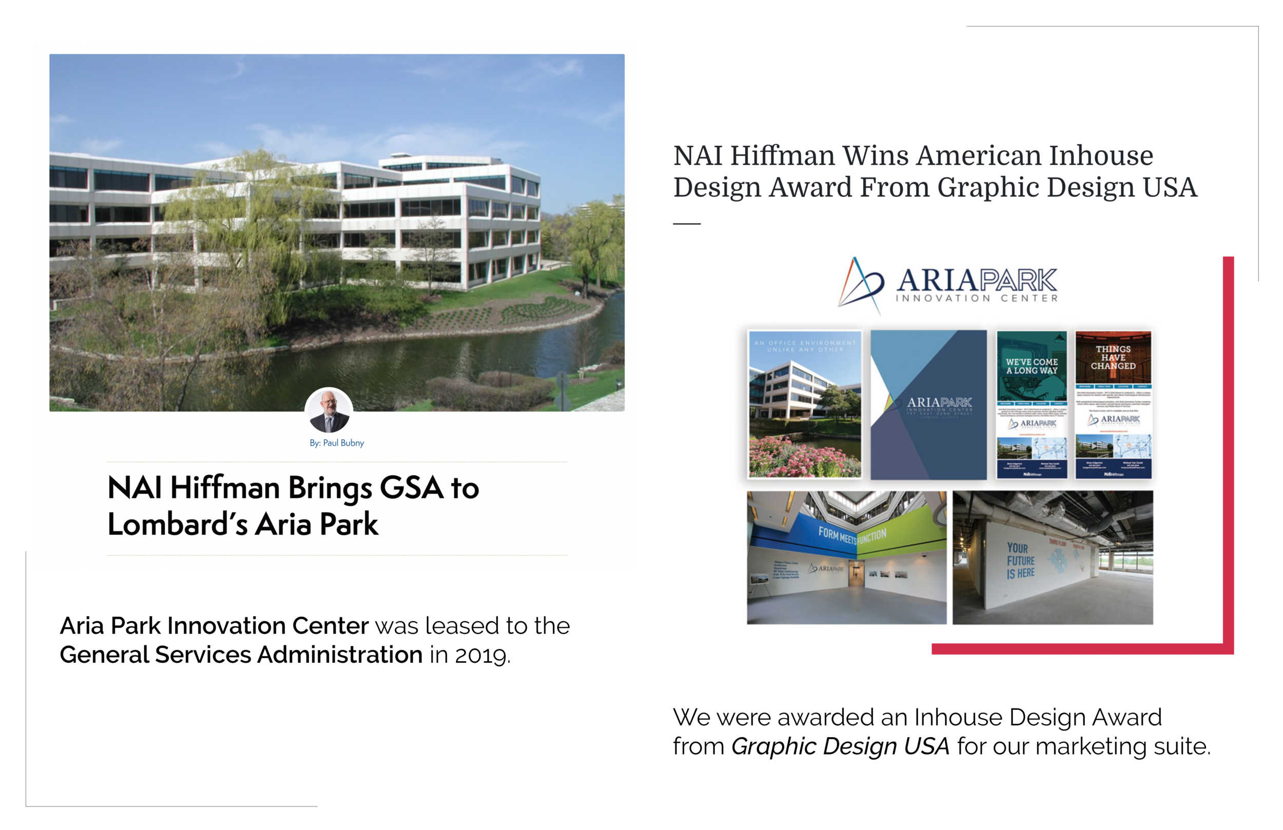
Marketing Suite - Aria Park Innovation Center
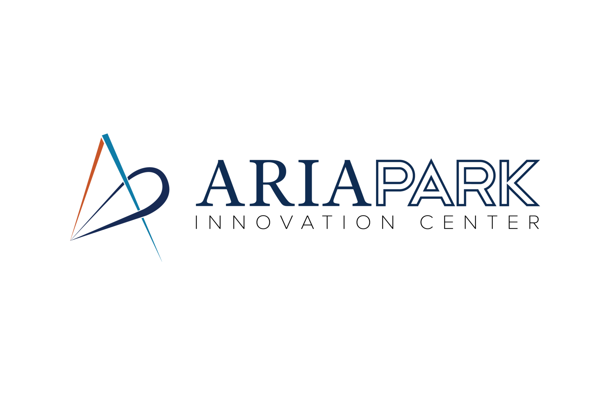
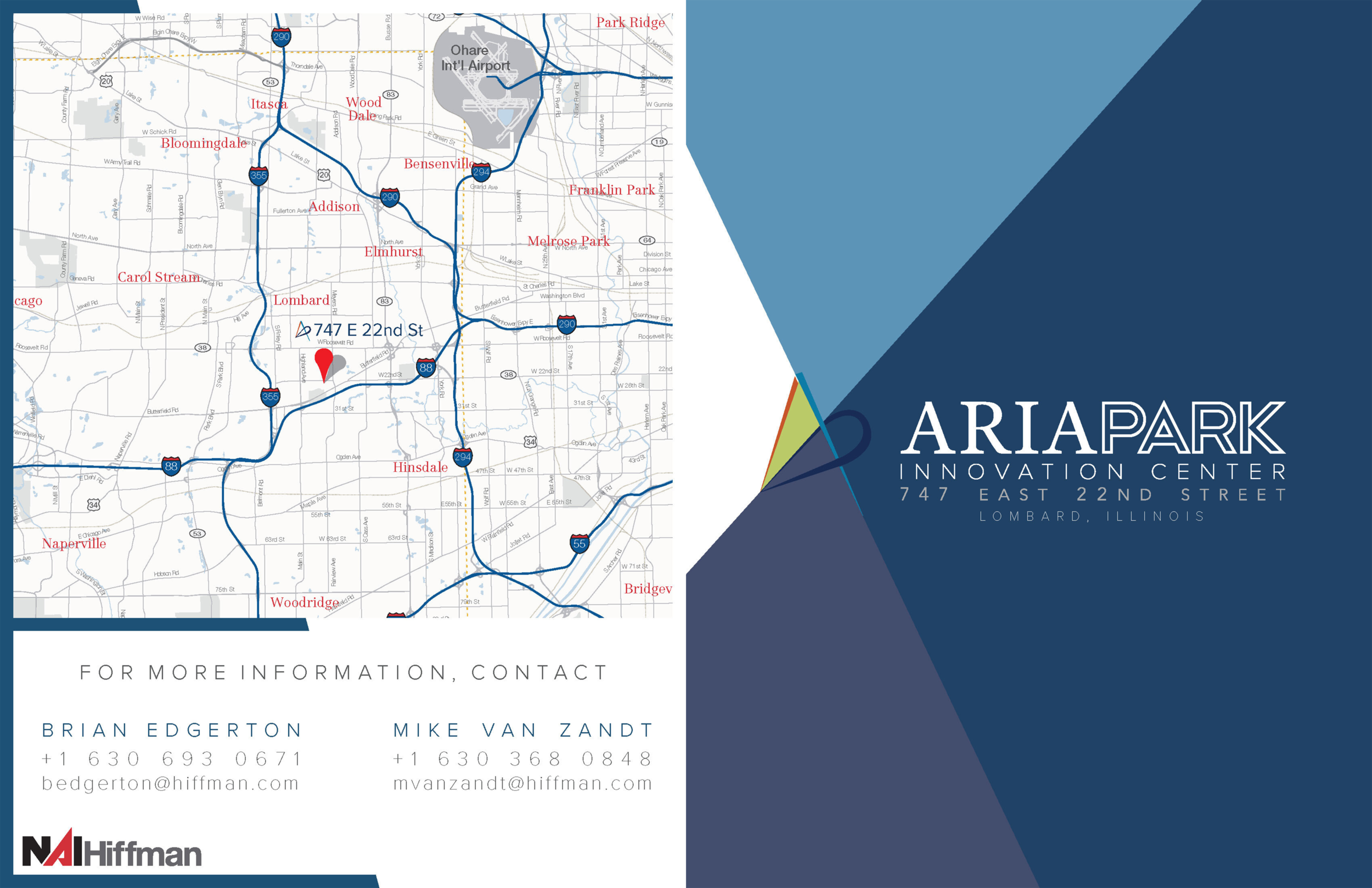
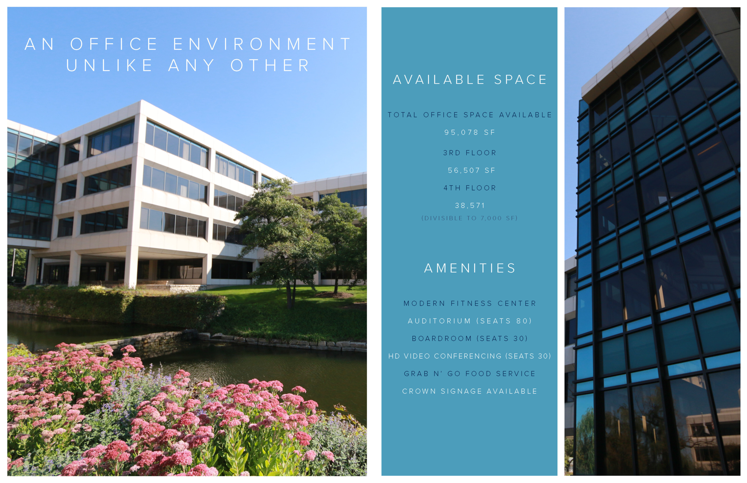
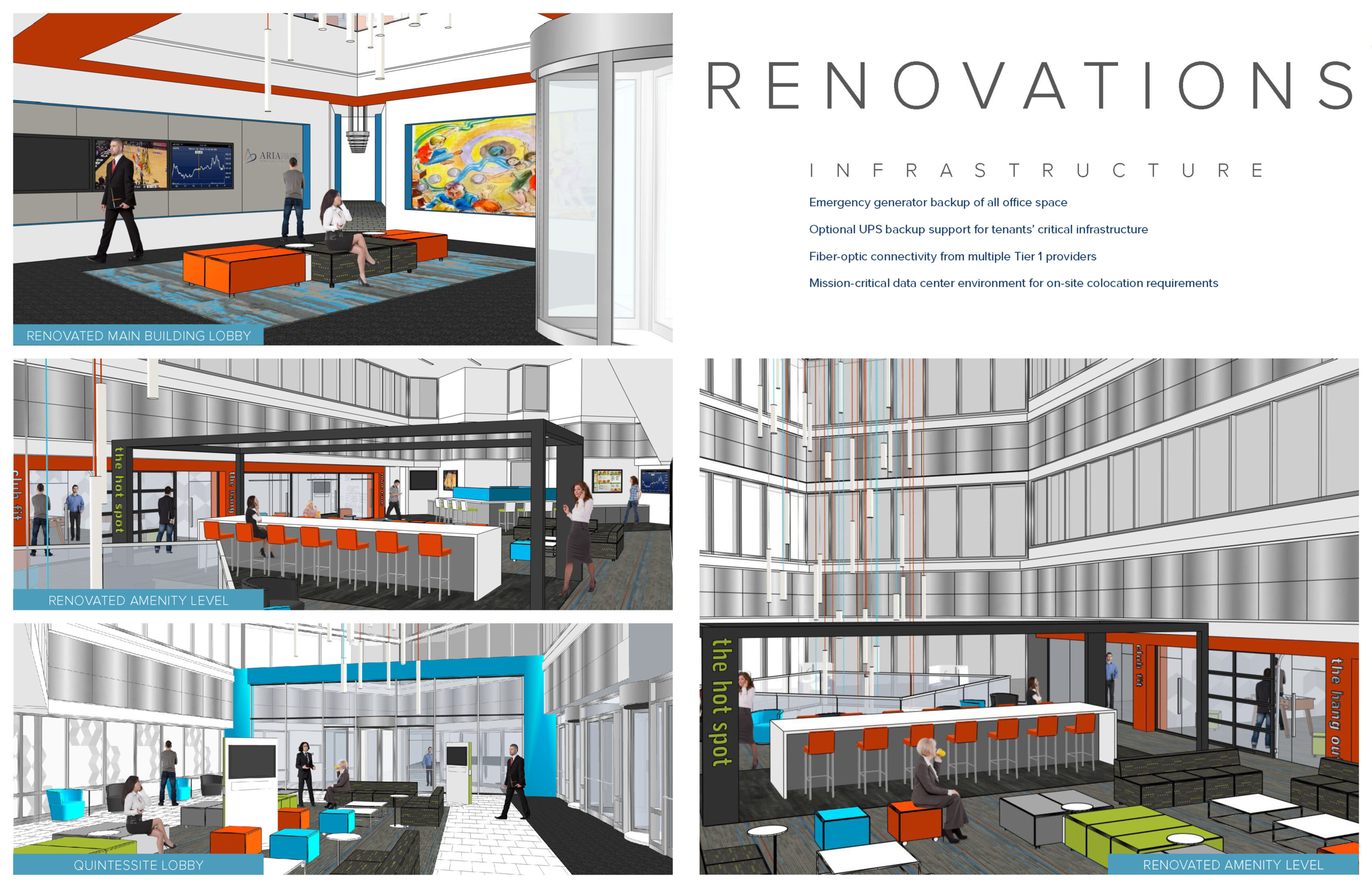
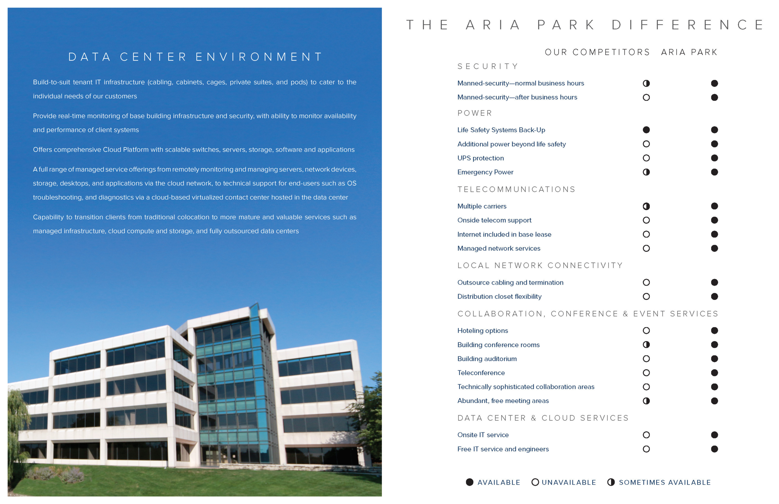
Rebrand 747 E 22nd Street under a new name, emphasizing the data center capabilities of the facility
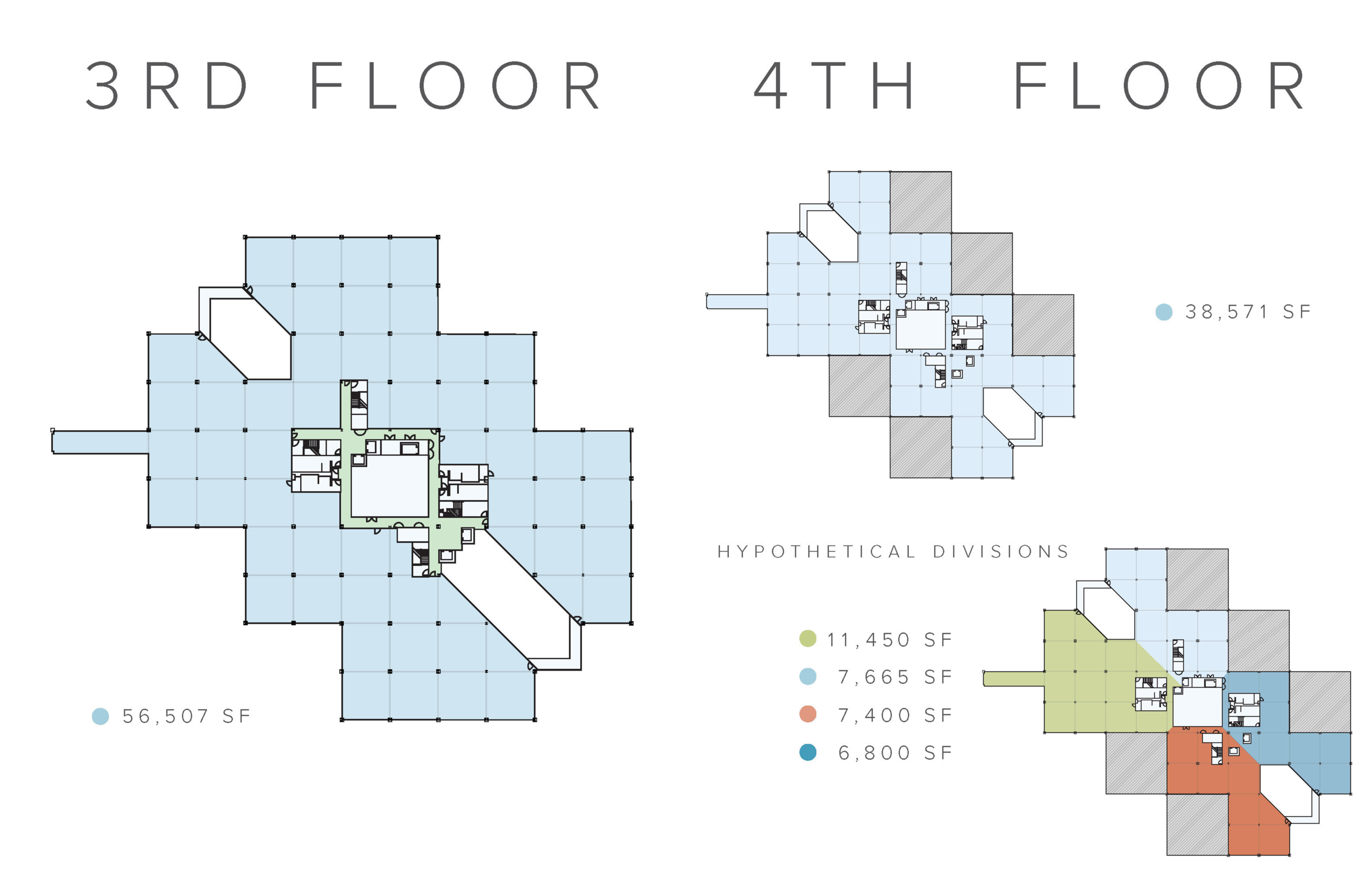
Goal: Lease the 95,000sf space to a large single client with need for data infrastructure
Tone: Professional, corporate, techy, forward-thinking
Name: “Aria”, meaning “air” in Italian (among other things) to reflect the cloud-computing infrastructure
Process: Experiment with organic shapes created from letters, compass emerges from design
Outcome: Building leased to GSA in 2019, won Graphic Design USA Inhouse Award for Marketing Suite
BRANDING - TECHNOCRAT COFFEE


Brand “Technocrat Coffee” as coffee for coders and tech industry
Goal: create a logo that evokes home-grown, locally-sourced coffee marketed to techies.
Process: Combine inspirations from classic American Trademark logos to create a classic logo
Tone: Emphasize energy, strength, and familiarity in designs
POSTER DESIGN - CHICAGO MIXTAPE FESTIVAL
Last minute poster request from music festival
Goal: Create new poster for festival in one night. Venue was unhappy with previous designer’s work due to illegibility
Process: Work fast and don’t question ideas. Trace photo taken of tape recorder and make text fit. Make it bold.
Tone: Rough, home-made, DIY. Colors emphasize Chicago flag with a calm, off-white background to make foreground pop
Album Release - Lullabies for the Restless


Multi-format design album release
Goal: Make a strong, eye-catching image that stands from Spotify to full LP size
Process: Manipulate and digitally repaint photo of woman in skeleton make-up. Re-design for various formats
Tone: Dark, scary, horror. All black and white, bold design